One long critique of the May 8, 2005 issue;
George W Bush was front and center, covering the first two pages. James Carney was chosen to write on the President. Was his assessment balanced? A stretched... yes. The first 2/3 was a list of issues the President has handled. Mr Carney feels on all the issues he listed the president has mishandled. MoreThancorn could have written an article with similar content and painted a much different picture of the president. All the issues listed can be argued as current failures, successes or maybe there has not yet been enough time to decide.... these are truly up for debate. In order on page 52; "Hurricane Katrina, high gas prices, the Jack Abramoff scandal, the CIA leak investigation, the Dubai Ports deal, a bulging deficit and above all Iraq. An invasion the President sold as vital to national security is now seen by most Americans as a war of choice-and a bad choice."
The photo of the President is large and black and white. It shows detail which would have been lost in a color photo.

It is a face of a be-wildered President Bush. His photo shows up earlier on the cover, page 22, 31, and twice in the center fold. Bono comes close with possibly 4 pictures in this issue.
An observation could be made for marketing an image for which pictures are chosen to represent people in their articles. For the President capturing him in a whince, a sigh, upset or surprised would always project one image of the President.


Add the above pictures to an arguably negative article and you come away from reading the magazine with an awful feeling about our country and President.
If pictures of the president saluting troops in Iraq, shaking hands with the crowd, dinner with Mrs Bush, or a meeting with his friend Tony Blair were chosen, different image and feeling would have been invoked.
Compare these with three descenters of the president;
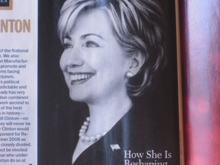
Hillary Clinton's segment. The picture, also black and white, softening the lines of a beautiful smile, showing calm and class.

This picture potrays what I see as expressions and emotions which are not often seen with the Senator from New York. The picture of a powerful Hillary Clinton is not donning the angry face I seen on C-Span. A face of condescending impatience, sometimes lightly filtered anger. The article about Senator Clinton was fare and right on the mark. Balanced, giving credit to her where credit is due; powerful due to her married name and a contender in 2008.
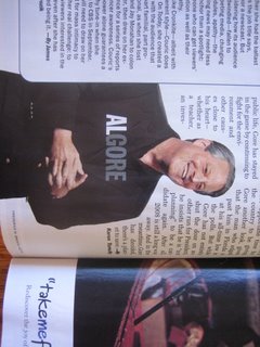
Al Gore is also an angry figure, with yelling and accusation filled speeches against the President.  (Yelling) "He played on our fears!" Remembering a speech he gave about Iraq in which he was screaming.
He is being shown with a grin ear to ear. A greying and growing-wiser former Vice President. The article is everything one could hope; complimentary, endorsing, inspiring, bigger than himself "And in the meantime, Gore has decided, there's a planet to save" [global warming]. It appears the author of this article, Karen Tumulty, is not hiding her agenda.
Another glaring difference in image is of Hugo Chavez and his article written by a Tim Padgett... The artist draws a rendition of a Hugo rant, some weeks lasting 6-hours. The picture portrays power, aggression and anger to be respected.  The article contains: "The rise of Venezuela's left wing President Hugo Chavez is a lesson in what can happen when the US disses an entire continent. After 9/11 when most Latin American nations refused to endorse the US invasion of Iraq, President Bush testily turned his back on the region....I sting those who rattle me."
A poor image was painted of the president with suttle picture choice. While those opposed to President Bush received flattoring pictures for their articles. It is my opinion the above pictures bring into question the objectivity of the Time editor.
It appears I have written about 2/3 of my post as negative this Time issue. Because it is not yet a balanced post, I will admit enjoyment in reading Time and would consider buying another issue in the future.
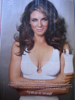
If there is another "got milk?" advertisement with Elizabeth Hurley, I will consider a subscription. Who's thirsty?


1 comment:
TESTING
Post a Comment